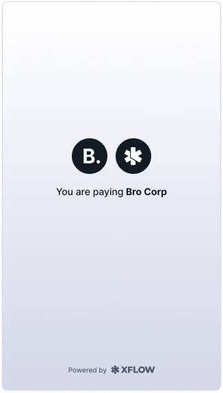
Xflow Checkout
Unified payment platform for international transactions
Introduction
When US businesses want to pay their Indian partners, the process shouldn't feel like navigating a maze. Yet for 30 million SMEs in India engaged in international trade, every payment is a gamble. Will it arrive? When? Will the details be correct?
We set out to fix this by creating a unified checkout experience that handles the complexity behind the scenes.
Role
Lead Designer, Researcher
Team
4 people
Duration
Ongoing project
Impact
- Reduced payment failure rate from ~30% to under 5%
- Average payment processing time decreased from 2-3 days to under 24 hours
- 85% of users selected saved payment methods on repeat transactions
- Dashboard adoption: 70% of invoice senders now use checkout pages
The Problem
Picture this: An Indian software agency invoices a US client for $10,000. The client wants to pay, but now comes the hard part.
1.Which payment method?
ACH? Wire? Check? Each has different fees, timelines, and complexity. The client is already confused.
2.Will it work?
Global banking communications fail. Details get entered incorrectly. Currency conversion issues arise. 1 in 3 payments had issues.
3.Where's my money?
Payments could take anywhere from 0.5 to 15 days with zero visibility into status or location.
The real challenge:
Our customers (Indian businesses) didn't control the payment experience—their clients did. And those clients were confused, making errors, and sometimes abandoning transactions entirely.
"Finding the right balance between Speed, Surety and Transparency was key".
Research & Approach
Design Hypothesis: What if we inverted the control?
Instead of Indian businesses sending bank details and hoping their US clients figured it out, what if we gave those clients a unified checkout experience? One that felt familiar, guided them through choices, and handled complexity behind the scenes.
Working with our Product team, we identified the key pain points across 50+ user interviews:
- Clients didn't know which payment method to choose
- No visibility into payment status created anxiety on both sides
- Manual data entry led to frequent errors
- Each payment method had different requirements and timelines
Design Principles
With multiple user types and varying payment methods, we needed clear guiding principles. We established three core principles that guided every design decision:
1. Empowering Business To Choose
We stand out by providing a single platform that aggregates all possible payment methods to choose from. Local payment options (ACH, checks, BNPL) available in their country, all in one familiar interface.
2. Transparency Builds Trust
Xflow is a new company in the market. Building trust is essential when we want businesses to transact large amounts of money internationally. Real-time tracking, clear fee breakdowns, and predictable timelines remove uncertainty.
3. Educate At The Right Moment
Ensure education is done at the right moment. It needs to be a supporting factor and not the main contributor. Guide users through complex choices without overwhelming them.
Iterations
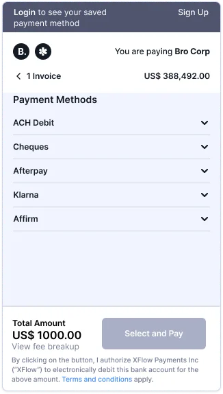
We wanted the experience to be as familiar as possible, following existing mental models for online checkout. Early explorations mapped out the journey: Sign up/sign in → View pending invoices → Select payment method (ACH Debit, Cheques, Afterpay, Affirm, Klarna) → Review → Confirm. We mapped scenarios for first-time vs. repeat users, happy vs. error states, and online vs. offline payment methods
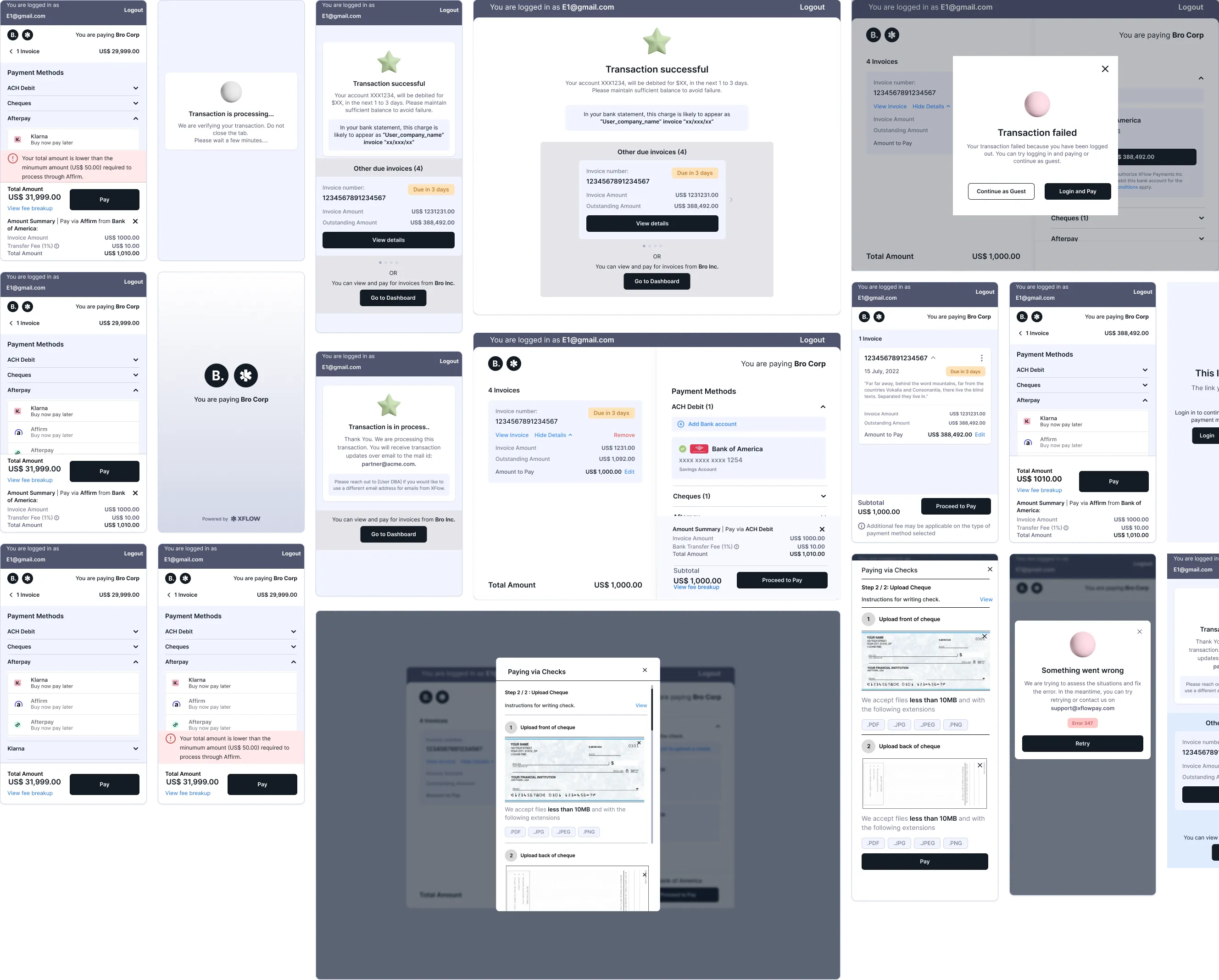
Mobile Wireframes
Early mobile wireframe explorations showing the complete checkout flow from login to confirmation. These screens map out the user journey across different payment methods and user states.
User Testing & Iterations
We tested the flows with customers in the USA and learned several important lessons about cross-cultural payment behaviors:
Key Findings:
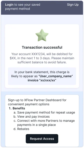
- Dashboard Benefits: Customers appreciated the ability to view and pay invoices, save payment methods for repeat usage (now at 85% adoption), and connect with multiple partners in a single place.
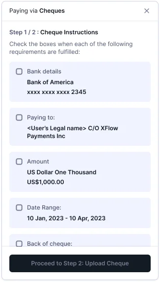
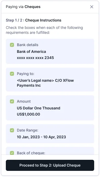
- Cultural Payment Differences: Checks are still common in US B2B payments, a surprise to our India-based team. We needed market-specific guidance.
- Instruction Skipping: Users tend to skip text, especially when writing checks. We needed strategic friction to ensure critical information was read.
- Mobile Constraints: Working with our engineering partners, we had to balance ideal design with development bandwidth. We experimented with multiple layouts that worked for both mobile and desktop.
Design Iterations:
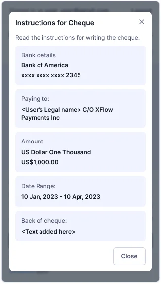
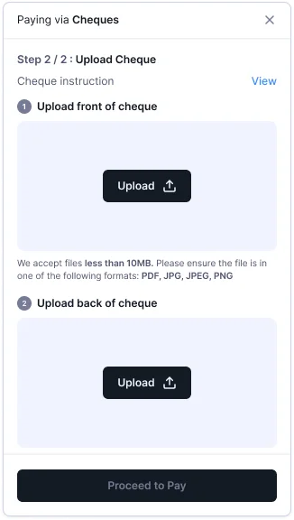
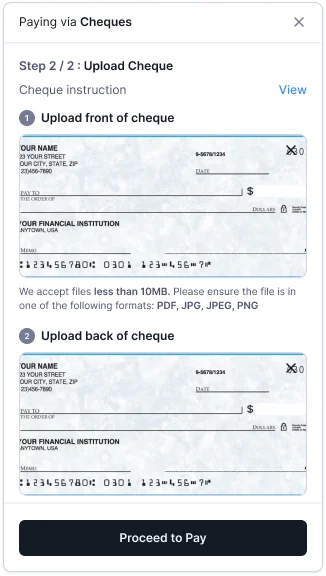
- Added step-by-step check instructions with visual samples (reduced errors by 30%)
- Introduced forced reading checkpoints at critical steps
- Redesigned confirmation screens for mobile responsiveness
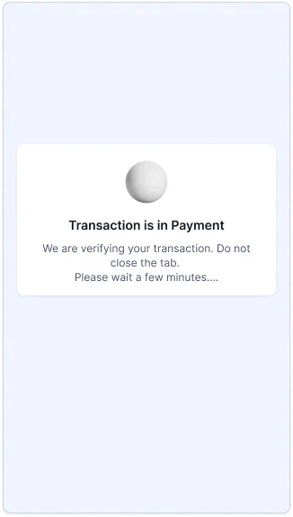
- Updated transaction-in-progress states with clear, reassuring messaging
- Pre-filled recipient details to eliminate manual data entry errors
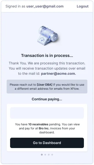
Final Screens for Mobile
We improved the wires to accommodate the new design and user testing feedback. Added forced reading checkpoints at critical steps and updated transaction-in-progress states with clear, reassuring messaging.
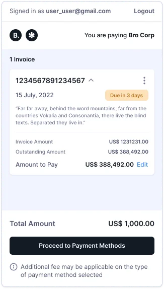
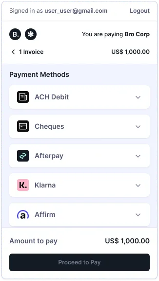
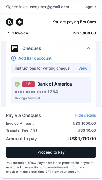
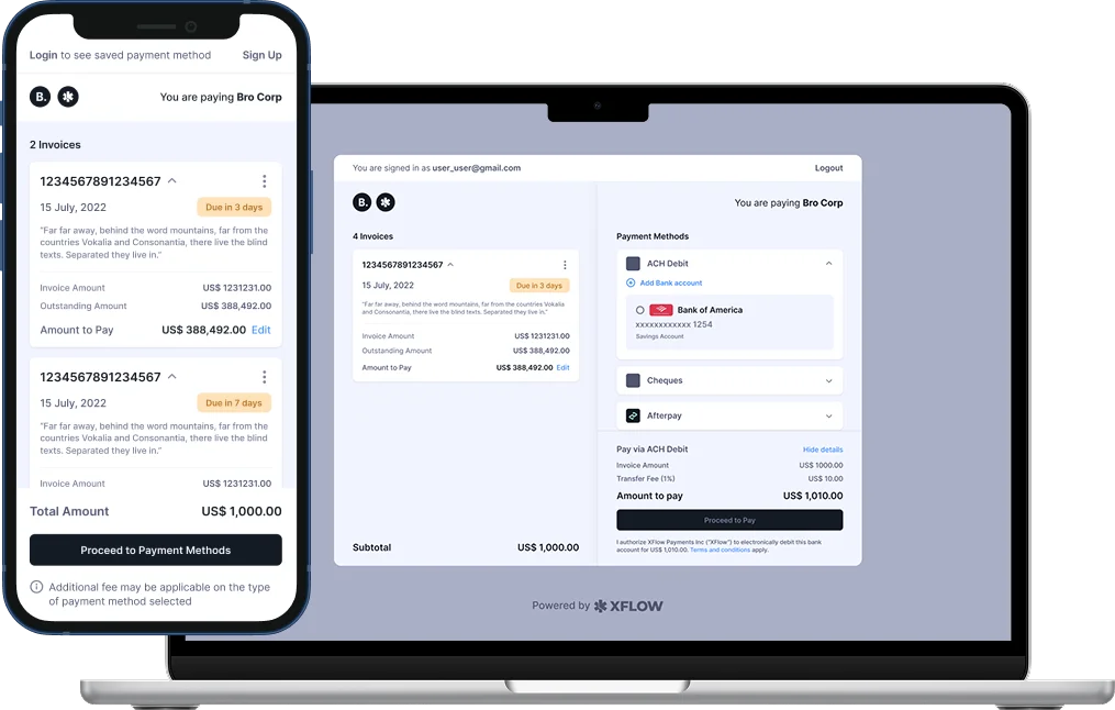
Final Screens for Desktop
The desktop experience provides a comprehensive view of the payment process, utilizing the larger screen real estate to show detailed invoice information alongside payment options.
The Solution
We designed a white-labeled checkout page that Indian businesses could send to their US clients. Think of it as Stripe Checkout, but purpose-built for cross-border B2B payments.
How it works:
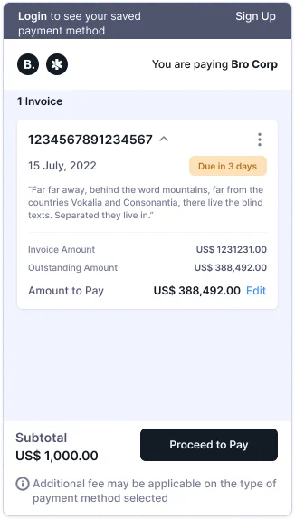
1. Indian business creates an invoice and generates a payment link
2. US client receives the link and lands on a familiar checkout experience
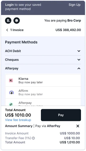
3. Client chooses their preferred payment method (ACH Debit, checks, Afterpay, Affirm, Klarna)
4. System pre-fills all recipient details—no manual data entry
5. Real-time status updates via email and dashboard
Key Features:
- Saved payment methods for repeat transactions (85% adoption rate)
- Part payments for invoice flexibility
- Due date tracking with automated reminders
- Mobile-responsive interface for payments on the go
Cross-Functional Collaboration
This feature had a lot of moving parts, 3rd party integrations (Klarna, Afterpay, Stripe), multi-currency support, and real-time status tracking. Success required tight collaboration:
Visual Design: Worked closely to create affirming elements and micro-interactions that built confidence during the payment process. Small delights like animated checkmarks and clear progress indicators reduced anxiety.
Product Management: Coordinated scope decisions—which countries to launch first (USA), which payment methods to prioritize, and how to balance feature richness with time-to-market.
Engineering: Stripe integration brought design constraints. We had multiple iterations discussing what was technically feasible within the given timeline. These constraints actually led to some of our better design decisions; simplicity won.
Impact & Reflection
Impact
- Payment failure rate dropped from ~30% to under 5%
- Processing time reduced from 2-3 days to under 24 hours
- 85% of repeat users now use saved payment methods
- 70% adoption rate among invoice senders using checkout pages
- Check payment errors reduced by 30% through strategic friction
What We Learned
Mental models vary across cultures. Checks are rare in India but common in US B2B payments. Designing for international users means researching local behaviors, not assuming universal patterns.
Strategic friction improves outcomes. Sometimes the best UX isn't the smoothest—it's the one that prevents costly mistakes. Adding pause points in the check flow reduced errors by 30%.
Simplify, don't hide complexity. Users appreciated transparency (seeing all payment options, understanding fees) more than we expected. Trust comes from clarity, not from hiding details.
Ongoing iteration matters. This project is still evolving. We continuously learn from user behavior, payment patterns, and support queries to refine the experience.