"Ok Google! Take the wheels."
Image of an infotainment screen in a car
Go to Projects

Personal Assistant for Car Users

Design of a system around the user - someone who drives to work. The system is hosted on cloud and interacts with the user via their car infotainment system, phones and other IoT devices. The objective is to increase efficiency, provide entertainment and reinforce safety of the user.
Team:
Prateek Singh, Kaavya Shakunthala, Pranav Bidwe, Richa Yadav, Devanshu Marwah, Avik Biswas

Project Duration:
8 Weeks

My Role:
System Architecture Design, collaborated on research, ideation, prototyping and user testing.

Skills:
HMI, UX Research, Wire Frames, Hi-Fi Mocks, Prototyping

“Car drivers need seamless accessibility over car controls without getting distracted.”


The Challenge

The very first challenge was to re-define the problem statement. The initial problem statement provided by the client was very open-ended and did not correctly capture the apparent requirements. After multiple rounds of stakeholder interviews and initial research, we narrowed down the problem statement by creating boundaries along these segments - Aspirations, Target user group and purpose of the product.
Empathy Map
Persona
Customer Journey Map

Research Insights

We conducted a guerrilla research and conducted interviews and surveys on a group of 49 people. People who own a car and/or drive it to work frequently were selected. We captured multiple data points and synthesized our findings. These findings were then presented to the entire team and project stakeholders. Some of these findings were significant enough that these would later pivot our design. e.g
  • Trust is one of the biggest deterrents to VUI acceptance as a primary mode of interaction.
  • The initial act of connection between the Car’s Infotainment system and the user’s phone continues to be the major pain point.
  • Almost one out of every three car accidents are due to the driver being distracted by their phones.
  • The use of technologies like AI and ML to increase car and driver safety is on the rise and has the potential to become the norm.

Market Analysis / Feature Analysis

We knew we were not the only ones trying to accomplish a good in-car user experience. There were already many well established players pioneering this field. The more we looked into it, the more we were in awe of the astounding amount of work that was being done. Mercedes-Benz, with its MBUX, was clearly leading the pack.
Brand Analysis
This clearly begged us to ask the question -

“What is it fundamentally different that our product can offer for it to stand out?

Market Comparison
We noticed a pattern among the features being offered by each of these companies/products. Every product offered a base set of features that constitutes an In-car experience. The amount of depth of these features varied from product to product. Each of these also had what we called a ‘secret sauce’ that was their identifying quality.
Upon even further analysis we could clearly see two very distinct and maybe even contradicting school of thoughts dictating how engaging the experience is:

The 2 schools of thought for in-car UX.

interaction icon
Interaction
Source - Tesla

Interaction Oriented

  • Prioritising the experience of the user.
  • Amount and depth of interaction highly adjustable by the user.
  • GUI-first type of interactions.
Why?
Highly versatile in breadth and depth of features that can be offered.
Sensory icon
Function

Function oriented

  • Prioritising function over engagement of the user.
  • Amount and depth of interaction dictated by the product.
  • VUI-first type of interactions.
Why?
Safer as the interaction is less distractive.

Limitations / Boundaries

After having diverged to gather a plethora of data, we begun to converge. The biggest act of convergence was to establish the limitations and boundaries of this project. Knowing very well that many of these are temporary boundaries put in place, so we could focus in a greater detail on the remaining agenda.
Android Icon
Built over Android Auto.
Technical Support Icon
Implementation of technology based on trends.
Driver Icon
Designing only for the driver.
India gate Icon
Designed for the Indian context.
Privacy Icon
Designed for private vehicles only.
Time Icon
Designing for 5 years down the line.

Ideation

At this point there was adequate clarity for us to wear our thinking hats and begin the ideation phase. We structured and re-structured the data along different parameters and observed the patterns that came up. We then performed a series of time boxed exercises within the core team as well as with the stakeholders and documented the ideas that emerged.
Ideation
Flowchart
5 Whys
Final Ideation
At this point there was adequate clarity for us to wear our thinking hats and begin the ideation phase. We structured and re-structured the data along different parameters and observed the patterns that came up. We then performed a series of time boxed exercises within the core team as well as with the stakeholders and documented the ideas that emerged.
Personalised cloud account
Fatigue detection of user
Emergency Situations
Assessing and Promoting good driving skills
Route Trivia at new locations
Schedule based triggers
Parking slots booking
Card Sorting
The system that we were developing would also replace the existing car infotainment systems and would serve as a platform for additional features. To ensure adoption by the users who are used to a car infotainment screen, we clubbed the major tasks into traditional lingo; the results of which are displayed below:
Card Sorting

System Design

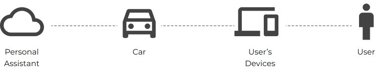
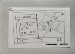
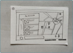
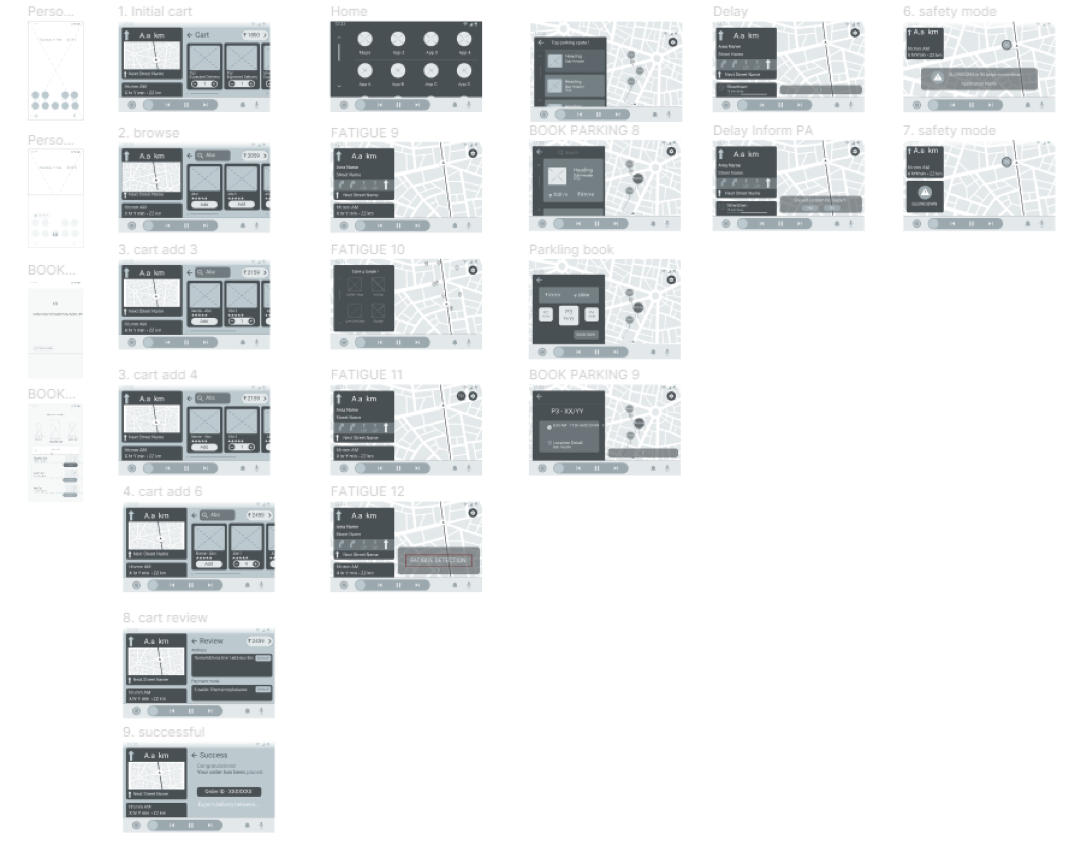
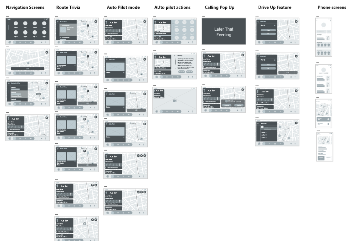
The System consists of four interconnected elements - the Personal Assistant, the Car, User’s devices and the user themselves. The car’s infotainment system and the user’s devices serve as the medium for the user to interact with the personal assistant. Additionally, based on the many different context that this interaction happens, there can exist three different states of the system.
Elements of
                    the system.
These states are:
Active State - When the user is inside the car.
Standby State - When the car is active and is expecting the user.
Inactive State - When the car is off and the user is interacting with the system using their personal devices.
web of elements
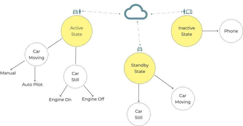
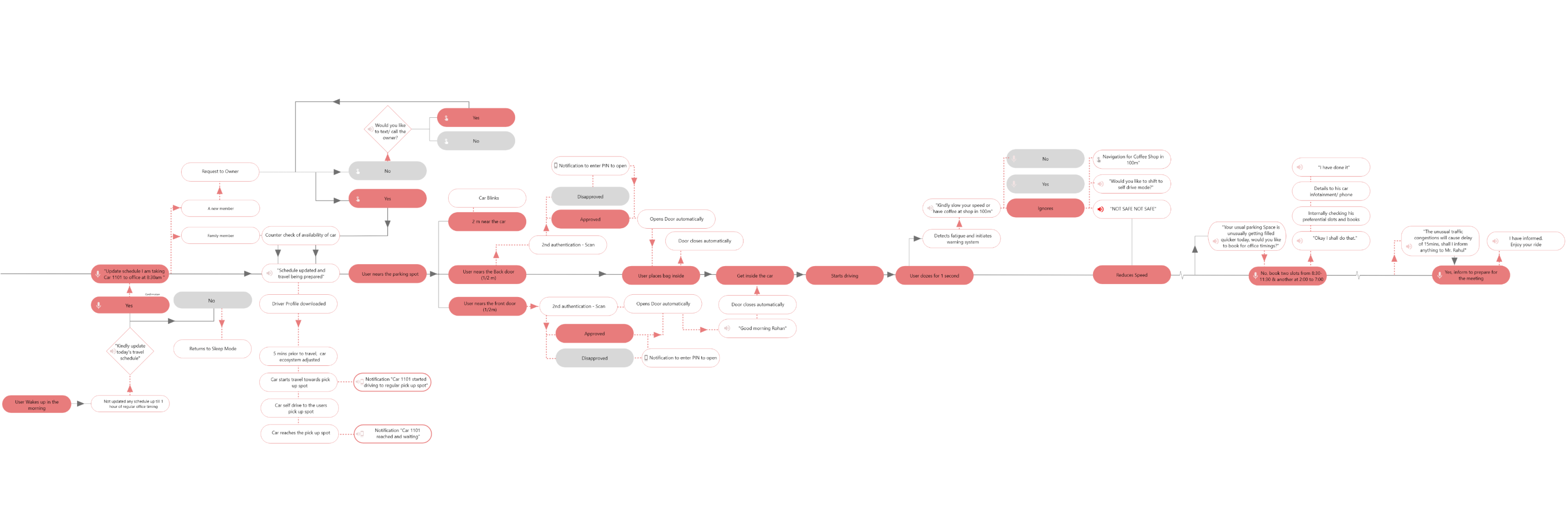
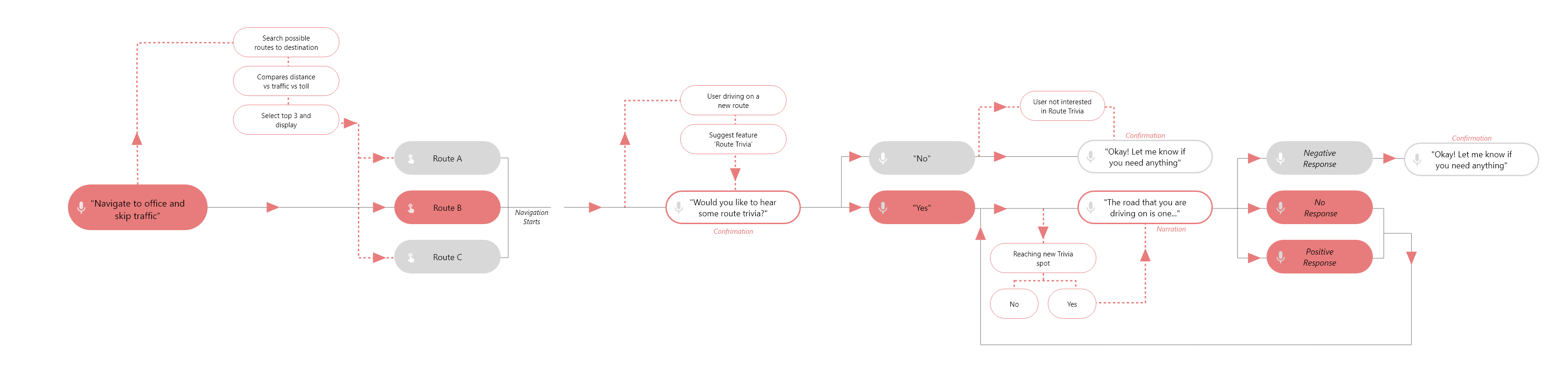
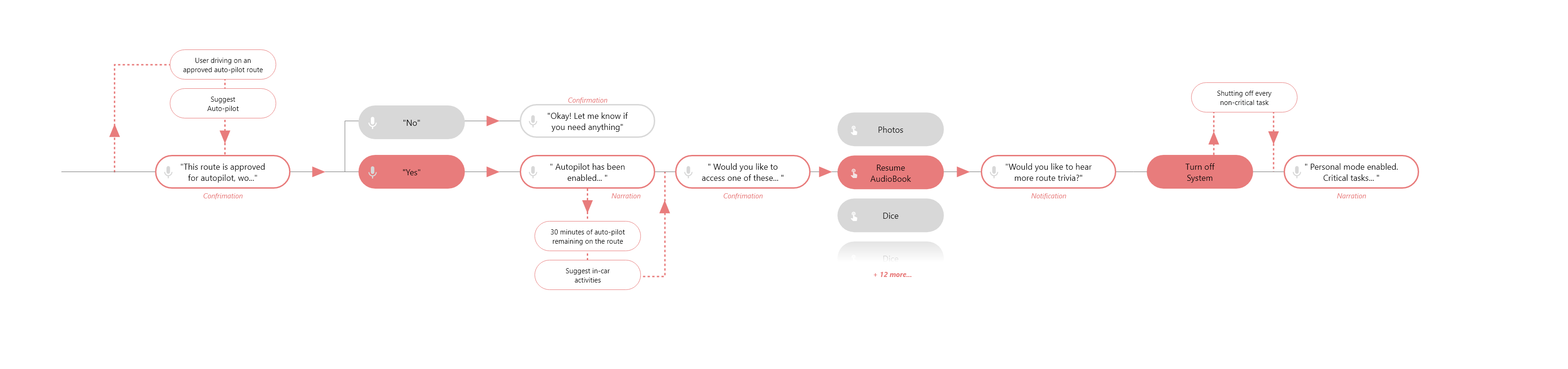
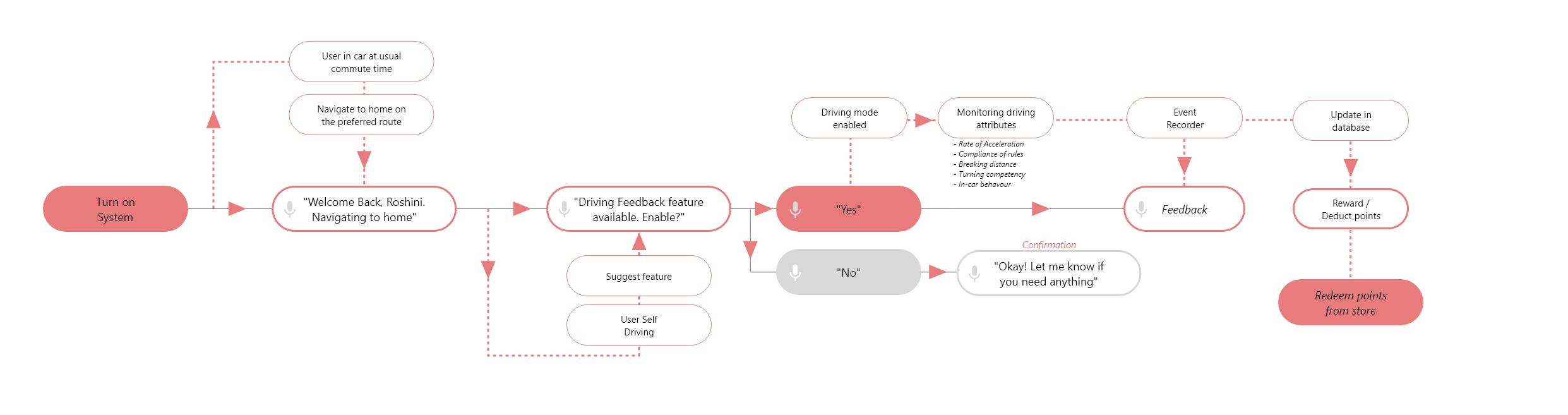
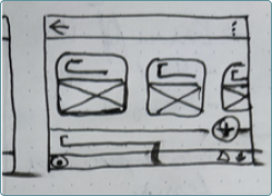
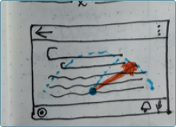
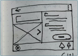
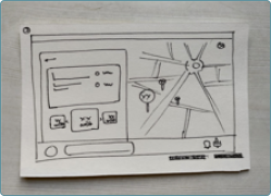
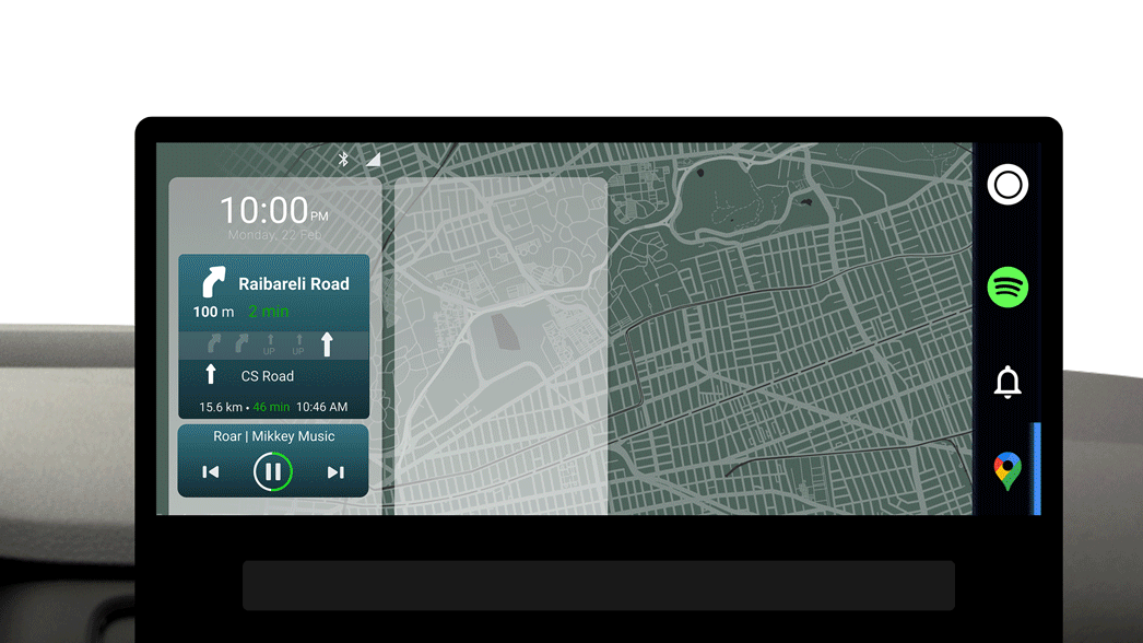
In this sprint we were focusing solely on the Active state and its hand off to the other states. The feedback loop as displayed below is the key to how we aim to achieve hyper-personalisation. The more the user interacts with the system, the more the system will be able to fine-tune to suit the user’s need.
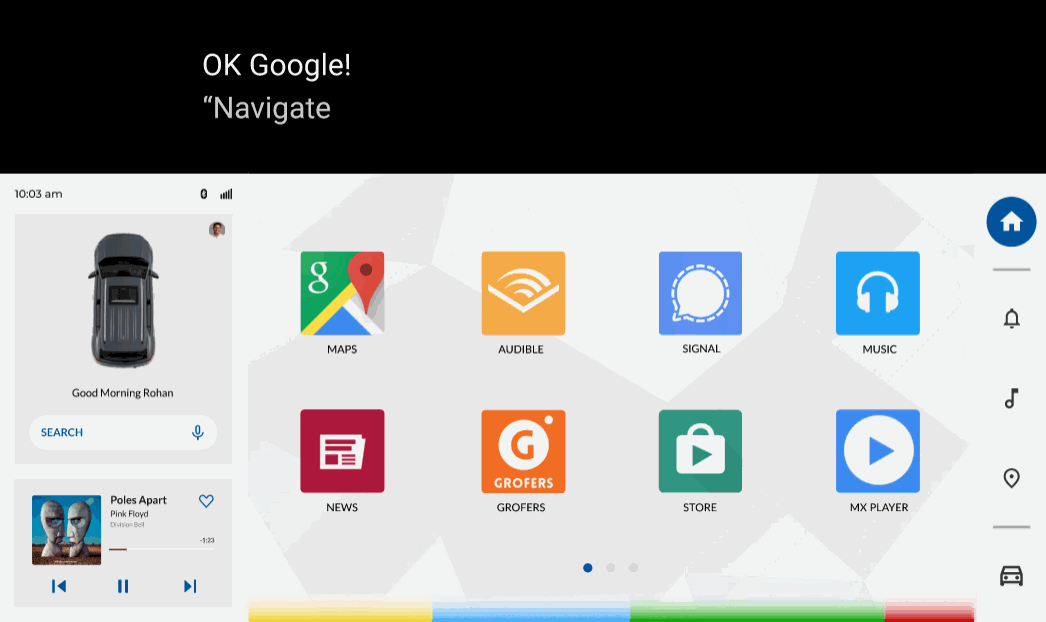
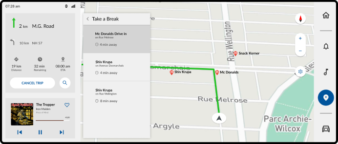
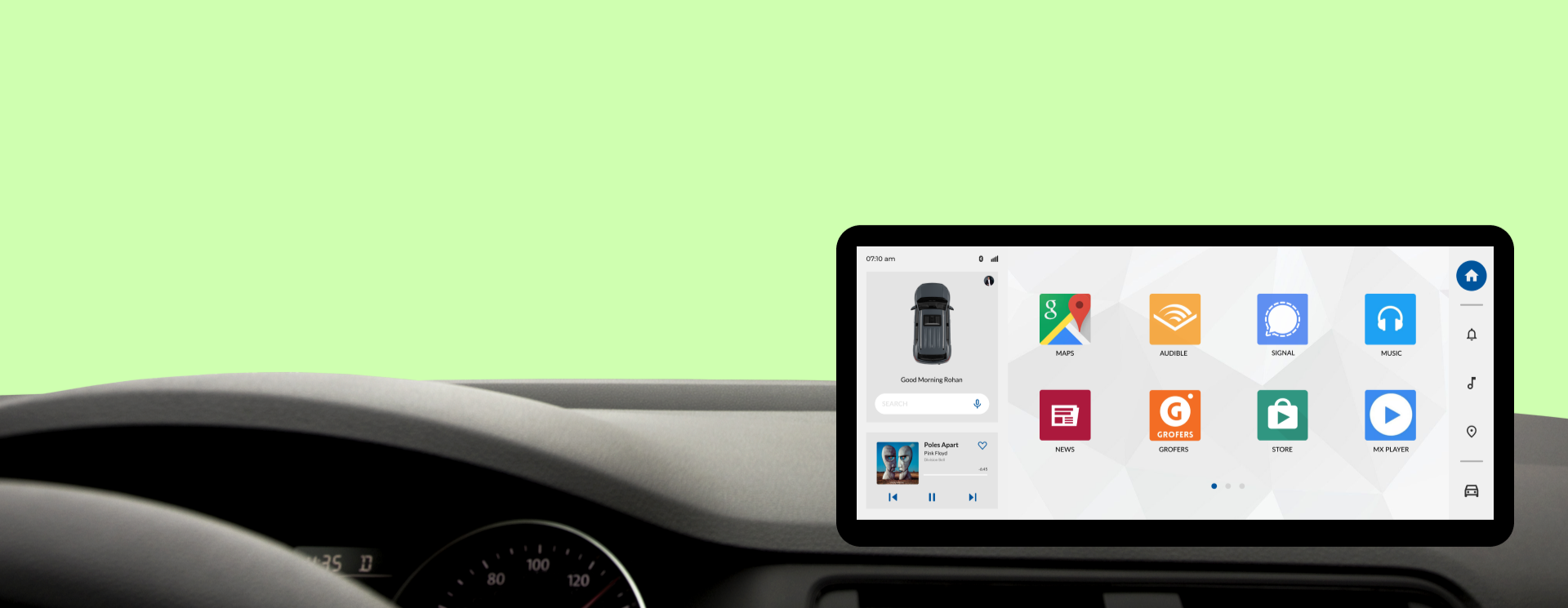
"Imagine it’s a Monday morning and you’re heading to work. You walk towards the car and its ready, expecting you with the AC and interior set to your liking. Playing your favourite music and navigation set to your office with a small detour to your goto cafeteria."

Use Cases

Using the eight selected features as the main story-points we stitched stories around. As a preliminary step we sketched out the system’s flowchart, documenting how the system would respond to a particular action or reaction of user.
This is where we understood that no response is a response in disguise.
Use Case
Use Case
Use Case
Use Case
* Click to enlarge

Experience hierarchy

Voice User Interface (VUI) vs Graphics User Interface (GUI)
Post our scrutiny of levels of engagement and interaction with the system inside car, we designed ours to be a hybrid model. We designed our system to be an VUI first and using GUI to supplement the information. Having an audio led interaction helps us achieve the following:
  • Nudging the user to reply with voice instead of touch, eliminating eyes-off-road.
  • Less distraction for the user.
  • More variety of choices at every interface.
We are building over Android Auto, hence the trigger for initiating interaction from the user is set to OK Google.
An example of VUI Interaction

Information Distribution

While the product is designed to take up screens of multiple resolutions and ratios, even a combination of screens as well. For the POC we developed the most common screen ration found in-car - 21:9.
The 21:9 is split into two part. The left 5:9 displays status and key information while the remained 16:9 displays the main content and also hosts the on-screen navigation keys.

Prototyping

We did quick paper mockups, took them to stake holders and capture their feedback. After a couple of rinse and repeat of the same, the entire team was able to arrive at agreeable middle ground for basic design layouts.
A Paper Prototype
A Paper Prototype
A Paper Prototype
A Paper Prototype
A Paper Prototype
A Paper Prototype
A Paper Prototype
A Paper Prototype
A Paper Prototype
A Paper Prototype
A Paper Prototype
A Paper Prototype
Low Fidelity Wireframes
With the paper prototypes in place; we took to software - Adobe XD here, to create screens needed for the two user flows that would also capture the eight selected features.
Scenario 1
This scenario is about Rohan who is commuting to and from office. He uses his commute time to be more efficient.
Tasks - Fatigue Detection, Booking parking slots, E-commerce.
Lofi
Scenario 2
This scenario is about Roshini who is commuting to and from office. She is a newbie in driving and uses her commute time to improve her driving skills and trivia.
Tasks - Route Trivia, Autopilot, Rewards
Lofi

Visual Design

This is when the major decisions regarding the branding of the product was taken. We arrived at the following key-words for how we visualised the product would be perceived:
Energetic, dynamic, futuristic & bold
We then went about creating the moodboards that would reflect the same emotion. As was required by the product we developed two versions - light and dark mode.
Moodboards:
Moodboard Night Moodboard Day

Interface Design

We translated the LoFi to High Fidelity screens using the moodboards that we had arrived at. Here too, we started off with multiple Mid-fi Screens and then post internal debates and discussions we arrived at the High fidelity screens.
Mid-fi Iterations
High Fidelity Screens
Hi Fidelity Screen Hi Fidelity Screen Hi Fidelity Screen Hi Fidelity Screen Hi Fidelity Screen Hi Fidelity Screen Hi Fidelity Screen Hi Fidelity Screen
Hi Fidelity Screen